Some Graphs of the Social Connectedness Index
2 Mapping Connections
We have two main types of charts to make here: two series of many charts of the same type, but across many counties individually; and two charts of the same type across all counties at once. As such, we are going to be doing slightly different things for each, even if the measure is similar. For each case, we will be using the us_counties.zip download from the SCI download page, which includes a list of pairs of user/friend fips codes and their respective (scaled) SCI value. We will take that dataset, and return geometries for the respective friend region fips codes (friend_region) using us_map("counties") (and drop the user_country and friend_country columns while we’re at it since we don’t need those). After this, our work diverges between the two types of charts. For the first (mapping each county individually), we create a process where we:
Grab a vector of the unique
user_regionfips codes in our data (n = 3204);Create a for-loop iterating over the length of that vector; where for i in each loop
Create a truncated dataset consisting of only one specific fips code for that loop where data is rescaled and binned into groups reflecting the significance (magnitude) of the SCI index for a given user-friend pair; and
Create and save maps for that fips code to its respective state folder accordingly.
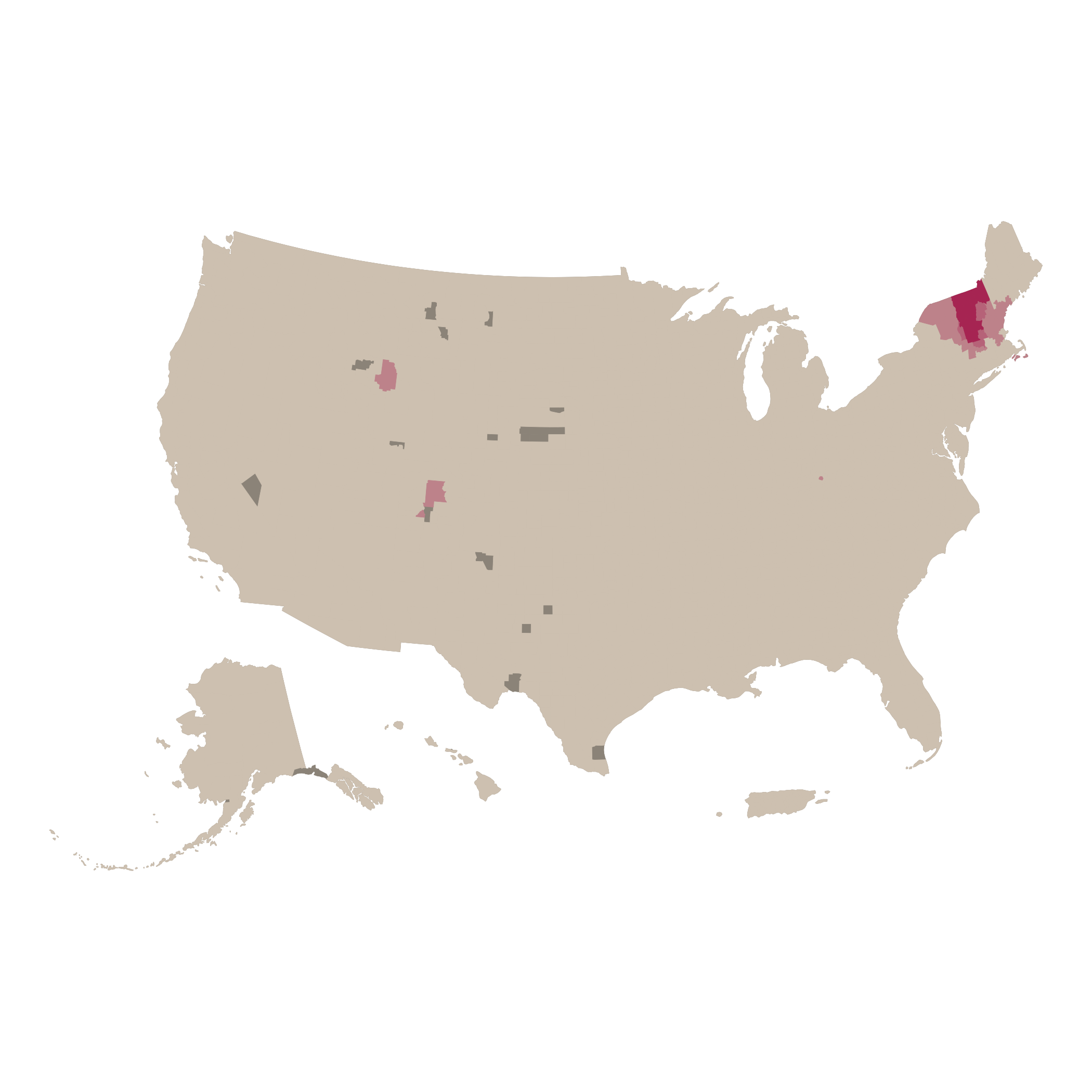
This process is reflected in the collapsed code chunk below. Here are the results for Rutland and Chittenden counties in Vermont:
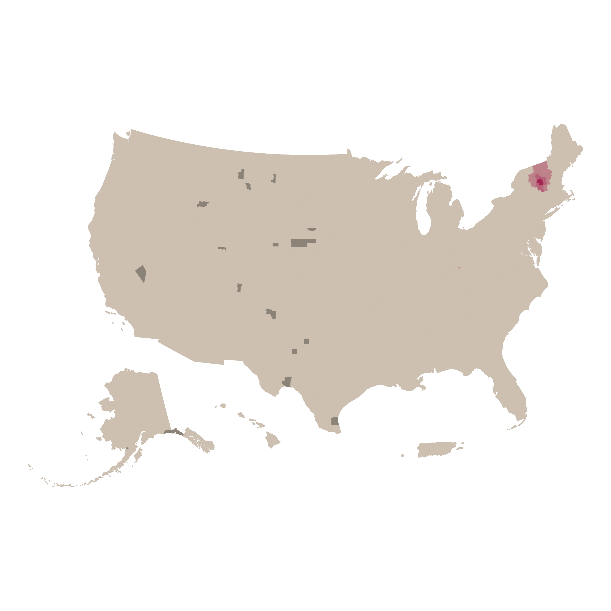

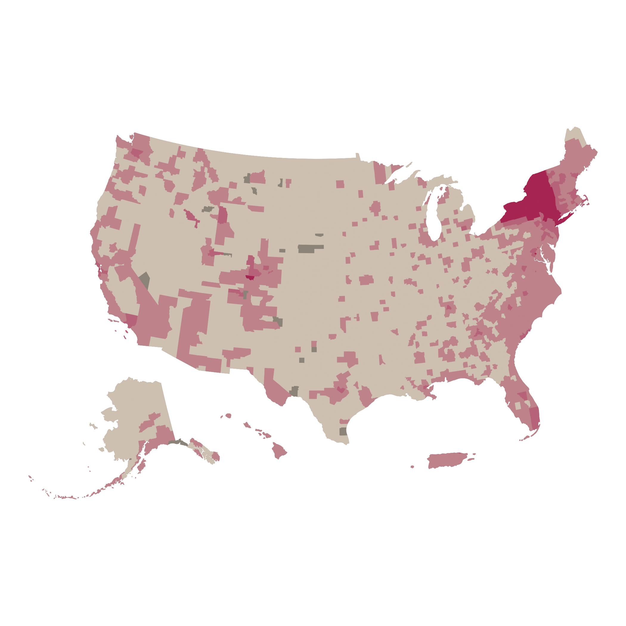
For our second series of maps, (state-to-county), we follow a somewhat similar process, but instead iterate by individual states (with a nested loop to gather the data for each county in a state). The results for New York and Vermont look like this, respectively: